This winter I am co-teaching a GIS course at the McGill School of Urban Planning. After confusing my students with a lecture on Moran’s , I thought I’d best come back to the concept and try to clarify it a bit.
Moran’s I is one of those ubiquitous concepts which permeate any field of applied quantitative research: Everyone uses it, but most of us would be unable to explain it in detail. Here, I am going to try to break it down through some visualizations and equations. The first part of the tutorial focuses on the Global Moran’s I, the second on it’s Local variant. In both sections, I will start with buildign a visual intuition, and then dive into the underlying Math.
Global Moran’s
Spatial Autocorrelation
The fundamental problem that Moran’s I tries to tackle is that of spatial autocorrelation, following Tobler’s famous “First Law of Geography”:
Everything is related to everything else, but near things are more related than distant.
This is not a complicated idea, it simply states that things in space tend to be grouped together. Let’s take an example. I want to see how shelter costs (rent + utilities) are distributed across Montreal. What kind of spatial pattern is there? For this purpose, I use Canadian census data from 2021.
I am going to hide codeblocks that are inessential for the tutorial and/or very long and complicated. Feel free to look at them if that helps!
Data and libraries
I start by loading all the necessary data and libraries.
Code
library(tidyverse)
library(cancensus)
library(sf)
library(spdep)
I use census data accessed with the cancensus package. To you use it you need to setup an API key.
Code
data_2021 <-
get_census(
"CA21", list(CD = "2466"),
vectors = c("v_CA21_4317", "v_CA21_560", "v_CA21_4315
"),
level = "CT", geo_format = "sf") |>
select(GeoUID,
shelter_30_2021 = `v_CA21_4315\n: % of tenant households spending 30% or more of its income on shelter costs (55)`) |>
as_tibble() |>
st_as_sf()
data_2021 <- data_2021 |>
filter(!is.na(shelter_30_2021)) |>
tibble::rowid_to_column("id")
data_2021 |> head()
Now we have the variable of interest, which is v_CA21_4315\n: % of tenant households spending 30% or more of its income on shelter costs. This is the percentage of tenants in each tract that spend 30% or more on shelter costs. We would expect this value to have a distinct spatial pattern. Looking at a map of the variable, what do you think?
Code
get_island_outlines <- function(data) {
all_islands <- st_union(data)
island_outlines <- st_cast(all_islands, "POLYGON")
return(island_outlines)
}
island_outlines <- get_island_outlines(data_2021)
Code
data_2021 |>
ggplot(aes(fill = shelter_30_2021)) +
geom_sf() +
geom_sf(data = island_outlines, fill = NA, color = "black", linewidth = 0.15) +
scale_fill_gradientn(
name = "Tenants paying > 30% for shelter",
colors = viridis::viridis(10)
) +
theme_void() +
theme(
legend.position = "bottom",
legend.title = element_text(face = "bold", size = 16),
legend.text = element_text(size = 14)
)
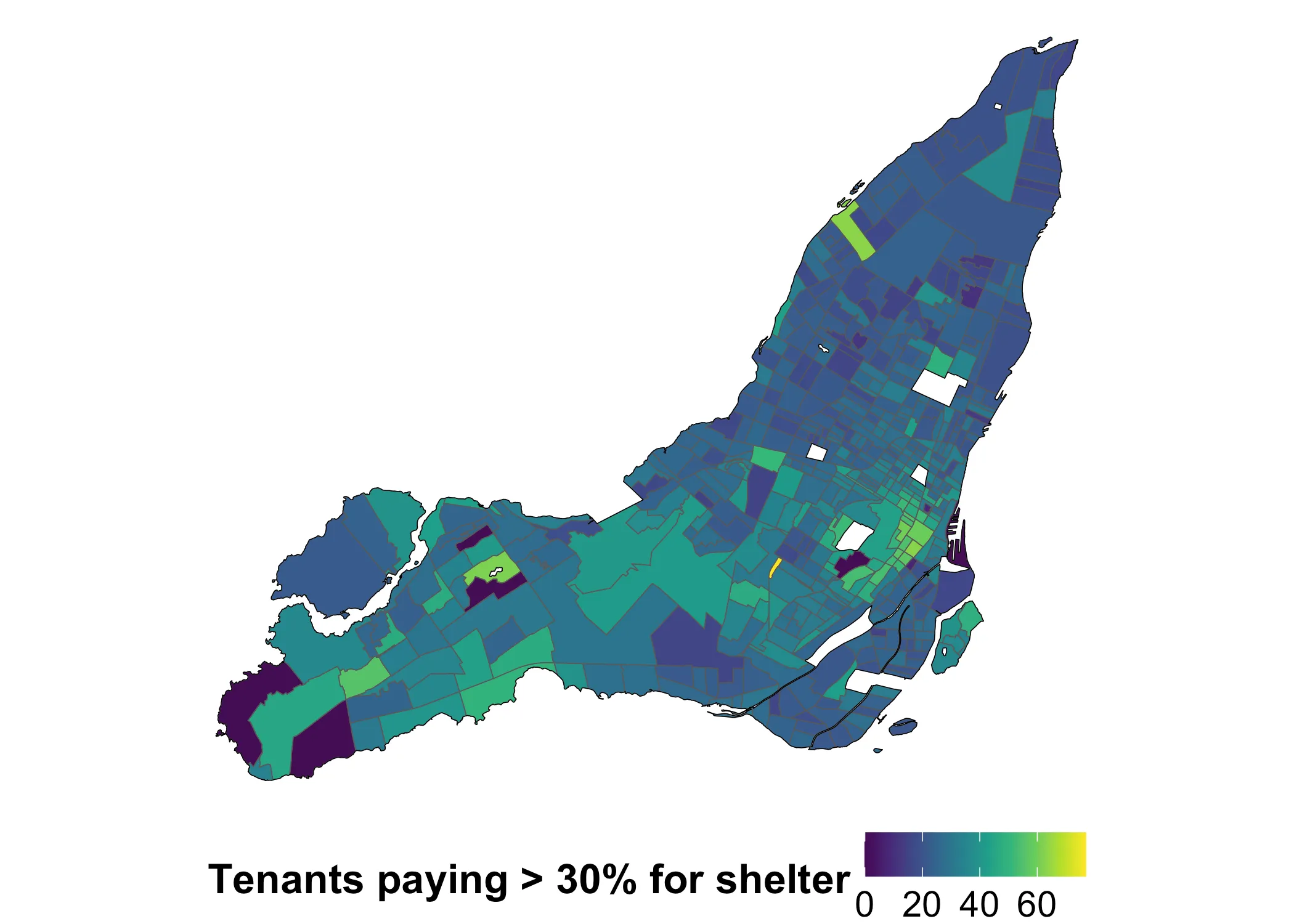
It looks like shelter costs indeed have a spatial pattern. How pronounced is this pattern? The answer doesn’t seem obvious. Luckily, Moran’s is the first tool for asking this question. We can calculate this using various R libraries. One common choice is spdep. Whatever library we use, we first need to define what counts as “nearby” on our map. I will use queen adjacency, which works like this:
nb_queen <- spdep::poly2nb(data_2021, queen = T)
Warning in spdep::poly2nb(data_2021, queen = T): neighbour object has 3 sub-graphs;
if this sub-graph count seems unexpected, try increasing the snap argument.
Notice the warning: neighbour object has 3 sub-graphs. Our weights matrix isn’t fully connected because L’Île Bizard and Nuns Island are separate from the rest of Montreal. I’ve created a few custom functions to get and map the links between census tracts. The initial queens adjacency structure connects census tracts like this:
Code
get_links <- function(data, nb) {
centroids <- sf::st_centroid(data)
centroid_coords <- sf::st_coordinates(centroids)
links_sp <- spdep::nb2lines(nb, coords = centroid_coords)
links_sf <- sf::st_as_sf(links_sp)
links_sf <- sf::st_set_crs(links_sf, st_crs(data))
return(links_sf)
}
plot_adjacency <- function(nb, data, island_outlines) {
links_sf <- get_links(data, nb)
ggplot() +
# Plot the polygons
geom_sf(data = data, fill = "grey", color = NA,
linewidth = 0.3, alpha=0.5) +
# Overlay the neighbor links in red
geom_sf(data = links_sf, color = "black", linewidth = .25) +
geom_sf(data = island_outlines, fill = NA, color = "black", linewidth = 0.3) +
theme_void()
}
plot_adjacency_comp <- function(nb1, nb2, data) {
links1 <- get_links(data, nb1)
links2 <- get_links(data, nb2)
island_outlines <- get_island_outlines(data)
ggplot() +
# Plot the polygons
geom_sf(data = data, fill = "grey", color = NA,
linewidth = 0.3, alpha=0.5) +
# Overlay the neighbor links in red
geom_sf(data = links2, color = "red", linewidth = .25) +
geom_sf(data = links1, color = "black", linewidth = .25) +
geom_sf(data = island_outlines, fill = NA, color = "black", linewidth = 0.3) +
theme_void()
}
Code
plot_adjacency(nb_queen, data_2021, island_outlines)
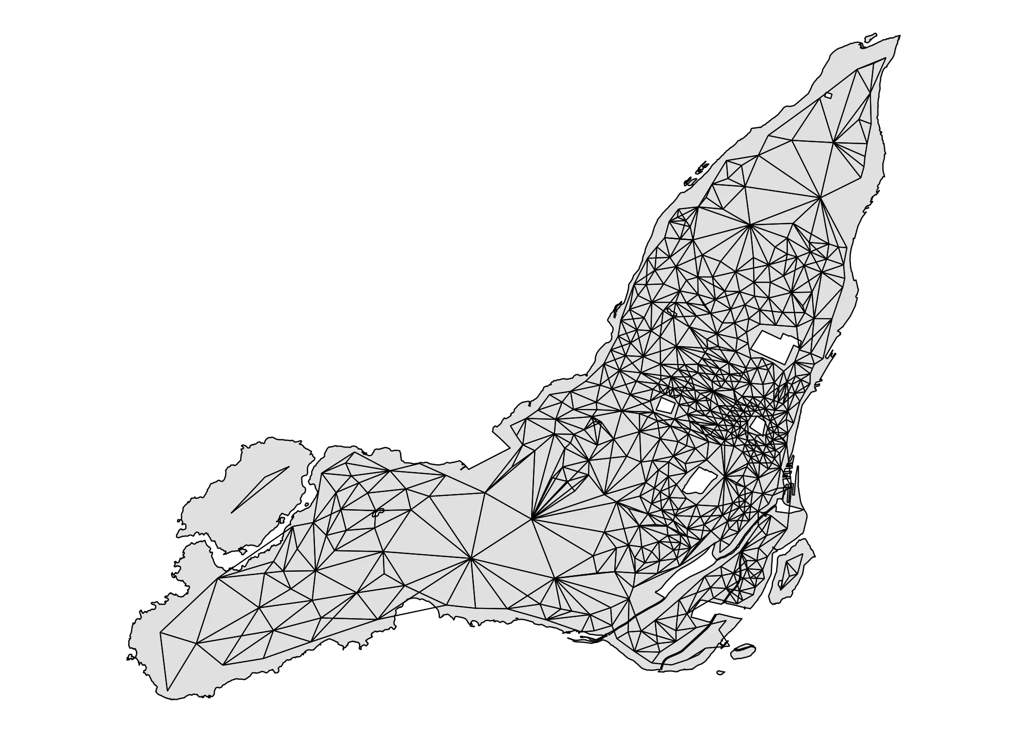
As you can see, the two above-mentioned islands are indeed disconnected from the rest of Montreal. We need to connect them. Using the tmap package I find the ID’s of the disconnected census areas and add them manually.
tmap::tmap_mode("view") # Switch to interactive mode
tmap::tm_shape(data_2021) +
tmap::tm_polygons(alpha = 0.5, id = "id")
Having identified good candidates for making the connection, we can use the addlinks1 function to actually do it:
nb_queen_plus <- nb_queen
nb_queen_plus <- spdep::addlinks1(nb_queen_plus, 451, 468)
nb_queen_plus <- spdep::addlinks1(nb_queen_plus, 444, 469)
nb_queen_plus <- spdep::addlinks1(nb_queen_plus, 76, 337)
summary(nb_queen_plus)
Neighbour list object:
Number of regions: 529
Number of nonzero links: 3142
Percentage nonzero weights: 1.12278
Average number of links: 5.939509
Link number distribution:
1 2 3 4 5 6 7 8 9 10 11 12 13 15 16
1 10 43 71 96 122 91 48 24 12 4 3 1 2 1
1 least connected region:
61 with 1 link
1 most connected region:
407 with 16 links
Now, having added the links (in red), we get this adjacency map:
Code
plot_adjacency_comp(nb_queen, nb_queen_plus, data_2021)
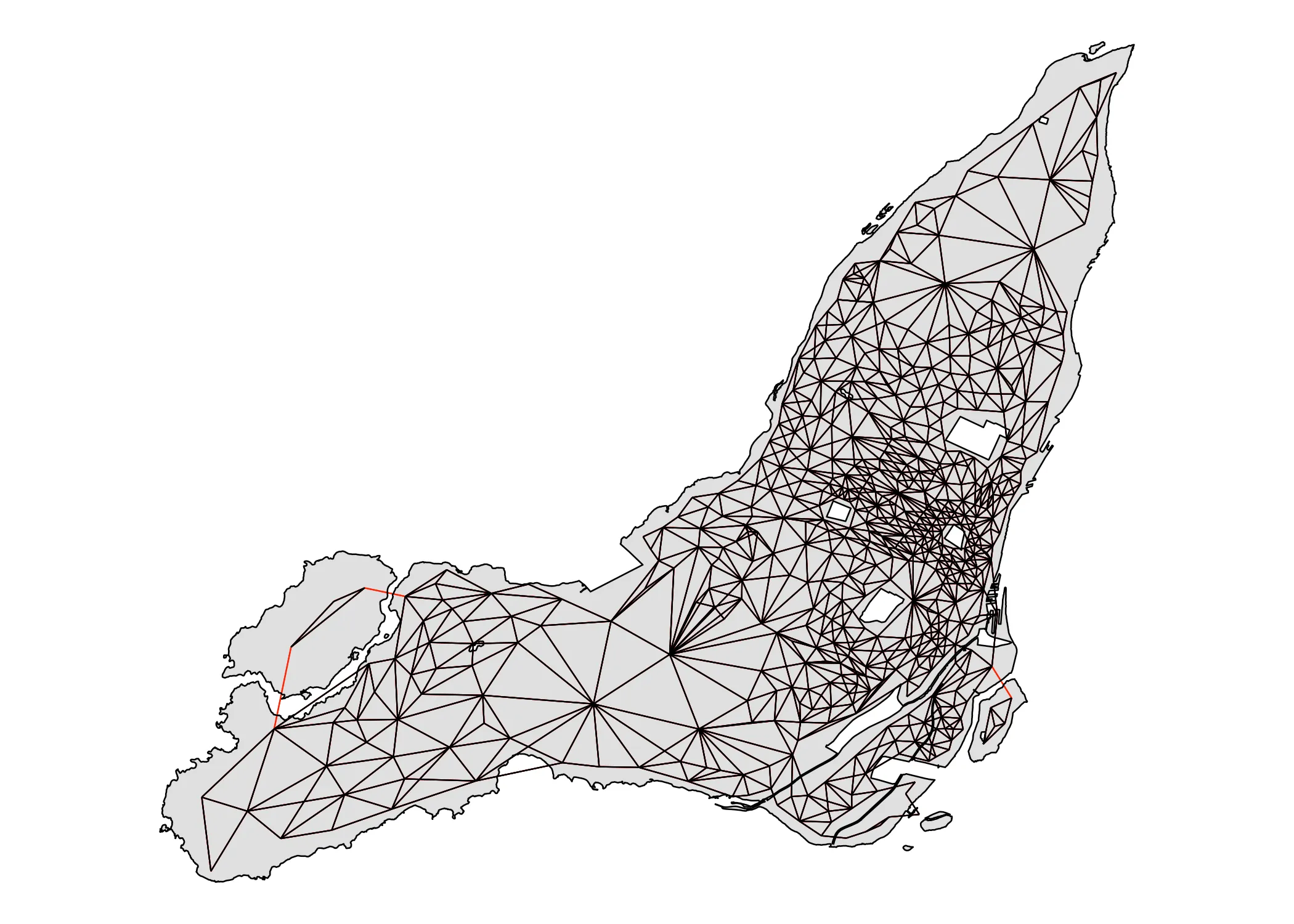
It is fully connected. We have what we need now to count Moran’s I! To calculate Moran’s I with spdep we use the moran.test function. As input, it requires (1) our variable of interest and (2) the spatial weights of our neighbourhood object. We create the latter using the nb2list2 function. We set style = W in order to make sure that the weight of the links between each area and its neighbors sums to . I will go more into this detail below, in the Math part of the tutorial.
nbw <- spdep::nb2listw(nb_queen_plus, style = "W")
gmoran <- spdep::moran.test(data_2021$shelter_30_2021, nbw,
alternative = "two.sided")
gmoran
Moran I test under randomisation
data: data_2021$shelter_30_2021
weights: nbw
Moran I statistic standard deviate = 13.385, p-value < 2.2e-16
alternative hypothesis: two.sided
sample estimates:
Moran I statistic Expectation Variance
0.3466502744 -0.0018939394 0.0006781103
Having fitted moran.test to our data, we get our Moran’s I value. It is 0.3467 and statistically significant at p < 2.2e-16. What does this all mean? I will start with a visual exploration of the concept, before diving into the Math.
Understanding Moran’s I visually
The core question that Moran’s I is trying to answer is this: On average, is there a pattern to how different values are located near each other in space. The pattern could be dispersion (negative autocorrelation), clustering (positive autocorrelation), or random (no autocorrelation). The range for Moran’s I is between and , with values below generally indicating dispersion, values above indicating clustering, and values in between them a random pattern. Since our Moran’s I is 0.3467, our data displays positive autocorrelation in the form of clustering.
In order to calculte this value, we need some definition of “near”. It is this threshold of what is near that we set above with spdep. It’s key for understanding Moran’s I, so let’s take a closer look at it. The traditional way of illustrating the concept of adjacency is using the following grid.
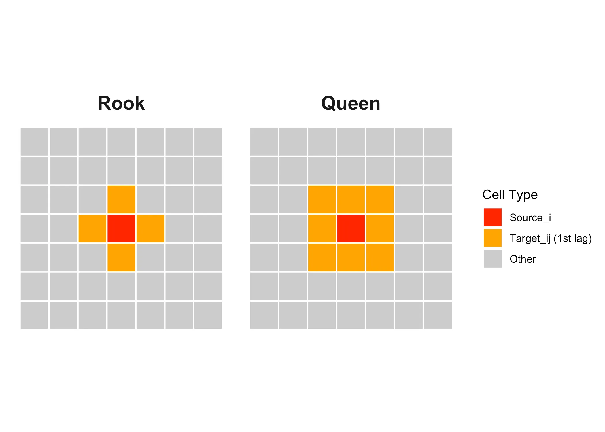
Here our “source” area of interest is marked in red and it’s neighbors or “targets” are marked in orange These are first-order neighbors, but we could also define neighbors in the second order, like the yellow squares below:
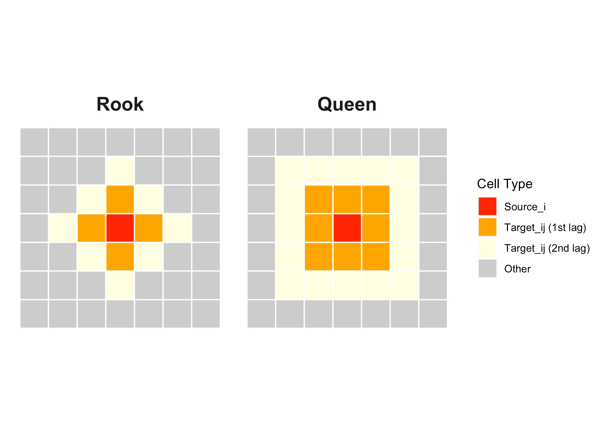
With “queen” adjacency, the neighbors of the source are all areas that share a border or a corner with the source. With “rook” adjacency, only areas that share a border count as neighbors.
Once we have decided on the neighbors, we can get to the point: What is the relationship between the values in the source and the target. Here, given the source, we call the values in the target areas the lagged values of the source. What Moran’s I does, is to inspect the relationship between the values in each target (i.e. each square in the grid) and all their lagged values. Through this comparison, a plot similar to the one below is often presented:
Code
create_lag <- function(data, var_nam) {
data <- mutate(data, var_std = as.numeric(scale(data[[var_nam]])))
data$lag_var <- spdep::lag.listw(nbw, data$var_std)
return(data)
}
set_quadrants <- function(data) {
data <- data |>
mutate(quadrant = case_when(
var_std > 0 & lag_var > 0 ~ "high(source) — high(lag)",
var_std > 0 & lag_var < 0 ~ "high(source) — low(lag)",
var_std < 0 & lag_var < 0 ~ "low(source) — low(lag)",
var_std < 0 & lag_var > 0 ~ "low(source) — high(lag)",
TRUE ~ NA_character_
))
return(data)
}
Code
data_2021 <- create_lag(data_2021, "shelter_30_2021")
data_2021 <- set_quadrants(data_2021)
Code
plot_scatter <- function(data, title) {
# Fit the linear model
fit <- lm(lag_var ~ var_std, data = data)
intercept <- coef(fit)[1]
slope <- coef(fit)[2]
# Create the annotation label using only the x coefficient.
label_text <- sprintf("Moran's I = slope = %.2f", slope)
# Choose a point along the regression line.
# Here, we use the median x-value.
mid_x <- max(data$var_std) - 1
mid_y <- intercept + slope * mid_x
# Compute the angle (in degrees) of the regression line.
# Using 140 because 180 is giving a weird tilt on the annotation.
angle_deg <- atan(slope) * 140 / pi
ggplot(data, aes(x = var_std, y = lag_var)) +
geom_point(aes(fill = quadrant),
shape = 21, size = 5, stroke = 0.1,
alpha = 0.7, color = "black") +
geom_hline(yintercept = 0, linetype = "dashed", color = "gray") +
geom_vline(xintercept = 0, linetype = "dashed", color = "gray") +
geom_line(stat = "smooth", method = "lm", formula = y ~ x,
size = 0.75, linetype = "longdash", alpha = 0.9) +
# Place the annotation at (mid_x, mid_y) and rotate it to match the line.
annotate("text",
x = mid_x,
y = mid_y,
label = label_text,
size = 4,
angle = angle_deg,
hjust = 0.5,
vjust = -0.5) +
scale_fill_manual(values = c("high(source) — high(lag)" = "#d7191c",
"high(source) — low(lag)" = "salmon",
"low(source) — low(lag)" = "#2c7bb6",
"low(source) — high(lag)" = "lightblue")) +
labs(title = title,
x = "Source value (i)",
y = "Target values (lagged i)",
fill = "Quadrant") +
theme_minimal() +
theme(
title = element_text(size = 24, face = "bold"),
legend.title = element_text(size = 16, face = "bold"),
legend.text = element_text(size = 12),
axis.title = element_text(size = 16, face = "plain"),
axis.text = element_text(size = 12),
legend.position = "bottom",
plot.margin = margin(.25, .25, .25, .25, unit = "cm")
) +
guides(fill = guide_legend(nrow = 2))
}
Code
plot_scatter(data_2021, "Lag plot for shelter expenditure")
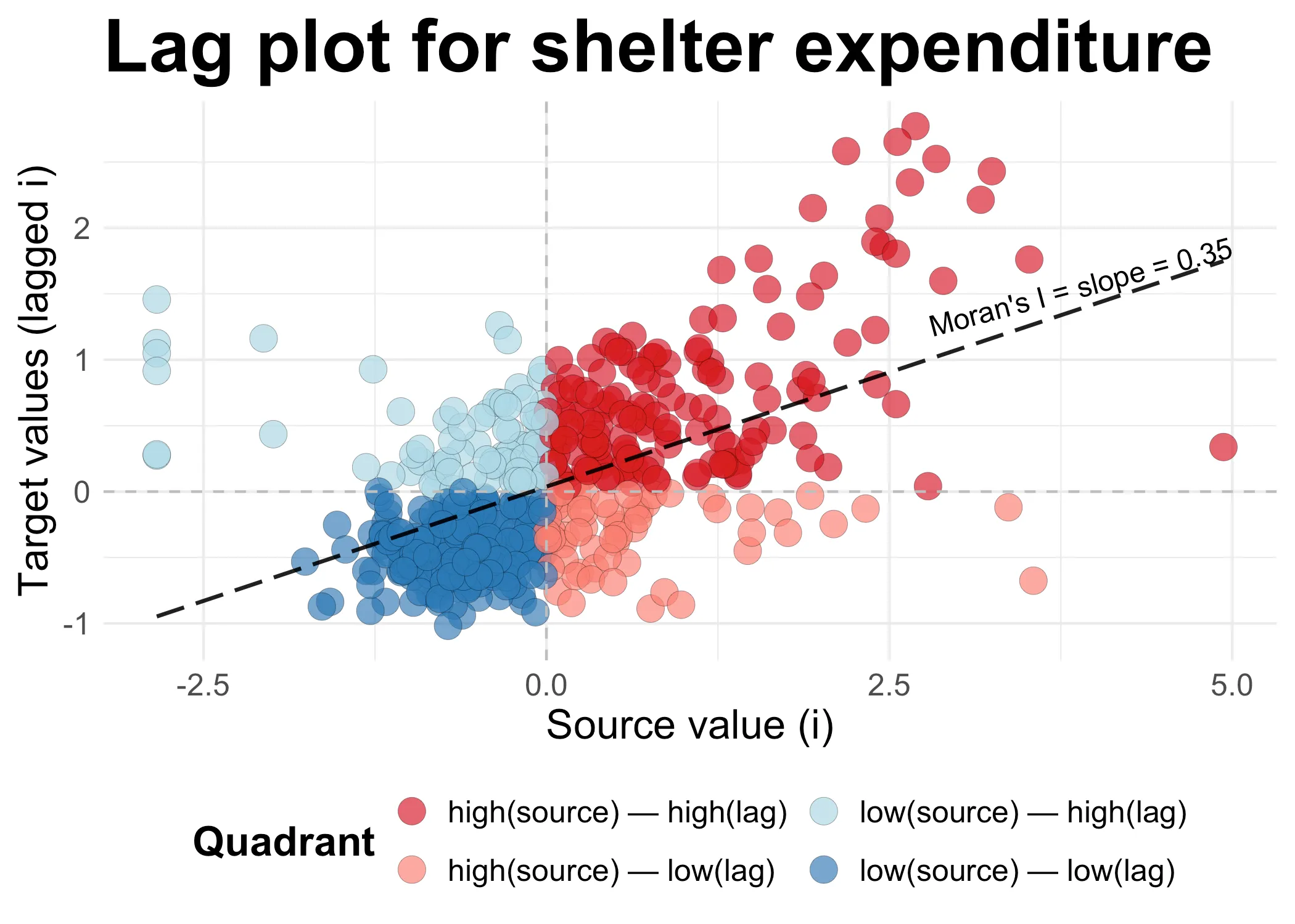
Now, let’s dwell on this plot for a minute. On the x-axis we have all the source values. For each area , we have simply recorded the value in the area. Next, on the y-axis, we have the values of all the neighbors of each , the “lag of ”. These y-values are formed through a normalized sum: We have added the lagged values and then divided them by the total number of neighbors each has.
When both the source and it’s lagged target values are high, we get in the dark red quadrant in the upper right corner. When they are both low, we get in the dark blue quadrant on the lower left. Both dark red and dark blue points combine to a higher Moran’s I: They are an indivation of clustering among high (dark red) or low (dark blue) values. The other two quadrants are where neighbors are dispresed: high values tend to be located nexts to low values (light red), and vice versa (light blue).
In our case, there is clustering, so Moran’s I is positive, 0.3467. This value is, as we will see when we get to the math below, the slope of the line in the scatter plot above. Moran’s I is the slope of this plot. Because values are clustered, the slope is positive. If the pattern would be dispersed, then we would see more points in the light red and light blue quadrants: The slope would be negative. If we had a similar distribution of clustered and disperesed values, the slope would be near zero.
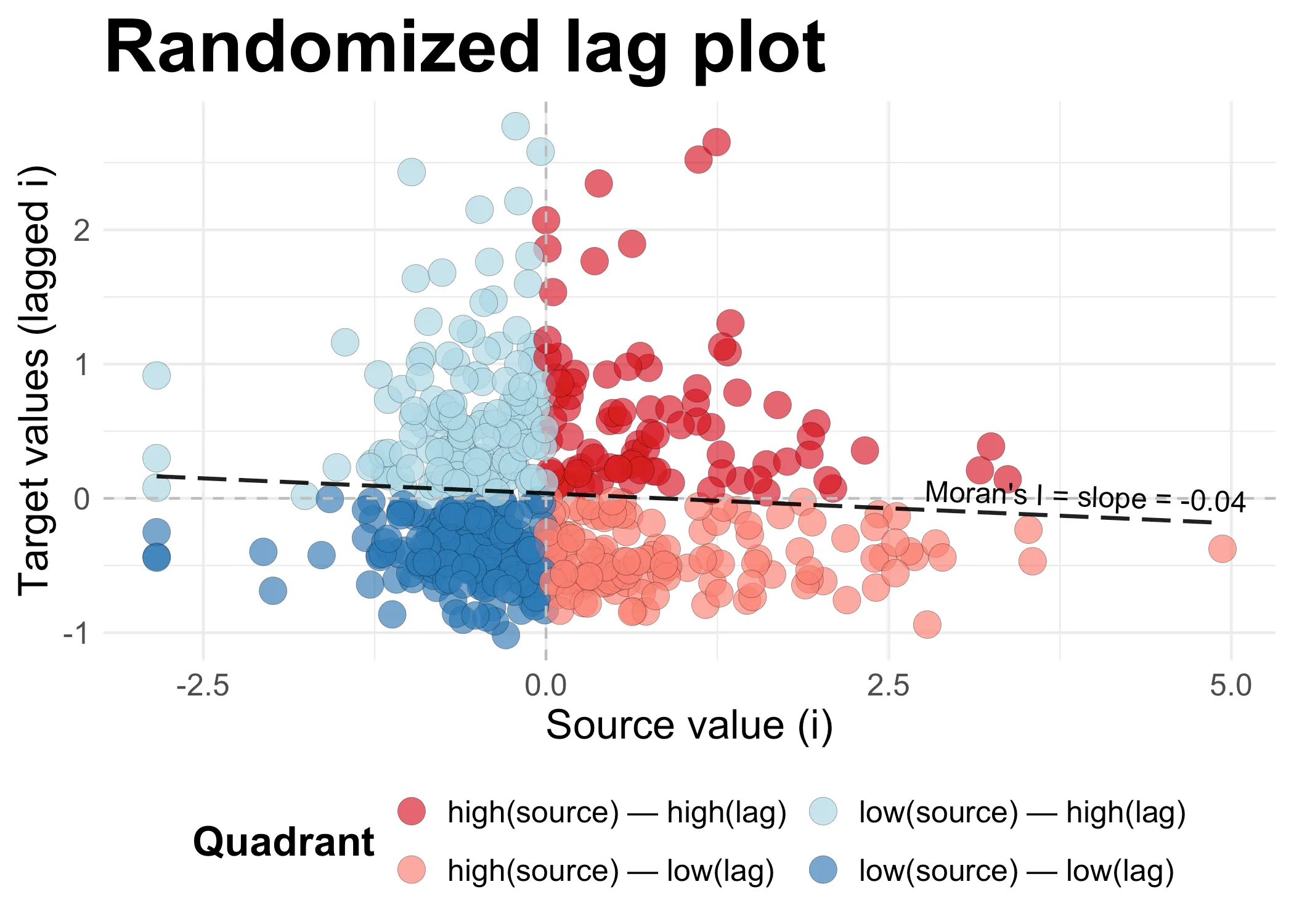
Consider this carefully. In the scatter plot below, I have randomized the lagged values. This means that it’s (almost) entirely random whether high and low values are next to each other. What we get is a slope that at -0.04is near zero. There is a tiny bit of dispersal (the slope is negative), but the value is too close to zero to actually say the data is dispersed.
Code
set.seed(42)
data_randomized <- data_2021
data_randomized <- create_lag(data_randomized, "shelter_30_2021")
data_randomized$lag_var <- sample(data_randomized$lag_var)
data_randomized <- set_quadrants(data_randomized)
plot_scatter(data_randomized, "Randomized lag plot")
We can also look at a map of these same values in order to make sense of it all. Using the original (non-randomized data), we get the following map:
Code
ggplot() +
geom_sf(data = data_2021, aes(fill = quadrant),
color = "grey", size = 0.1, alpha = 0.7) +
scale_fill_manual(values = c("high(source) — high(lag)" = "#d7191c",
"high(source) — low(lag)" = "salmon",
"low(source) — low(lag)" = "#2c7bb6",
"low(source) — high(lag)" = "lightblue")) +
geom_sf(data = island_outlines, fill = NA, color = "black", linewidth = 0.15) +
labs(fill = "Quadrant") +
theme_void() +
theme(
legend.title = element_text(size=16, face="bold"),
legend.text = element_text(size=12),
legend.position = "bottom",
plot.margin = margin(.25, .25, .25, .25, unit = "cm")
) +
guides(fill = guide_legend(nrow = 2))
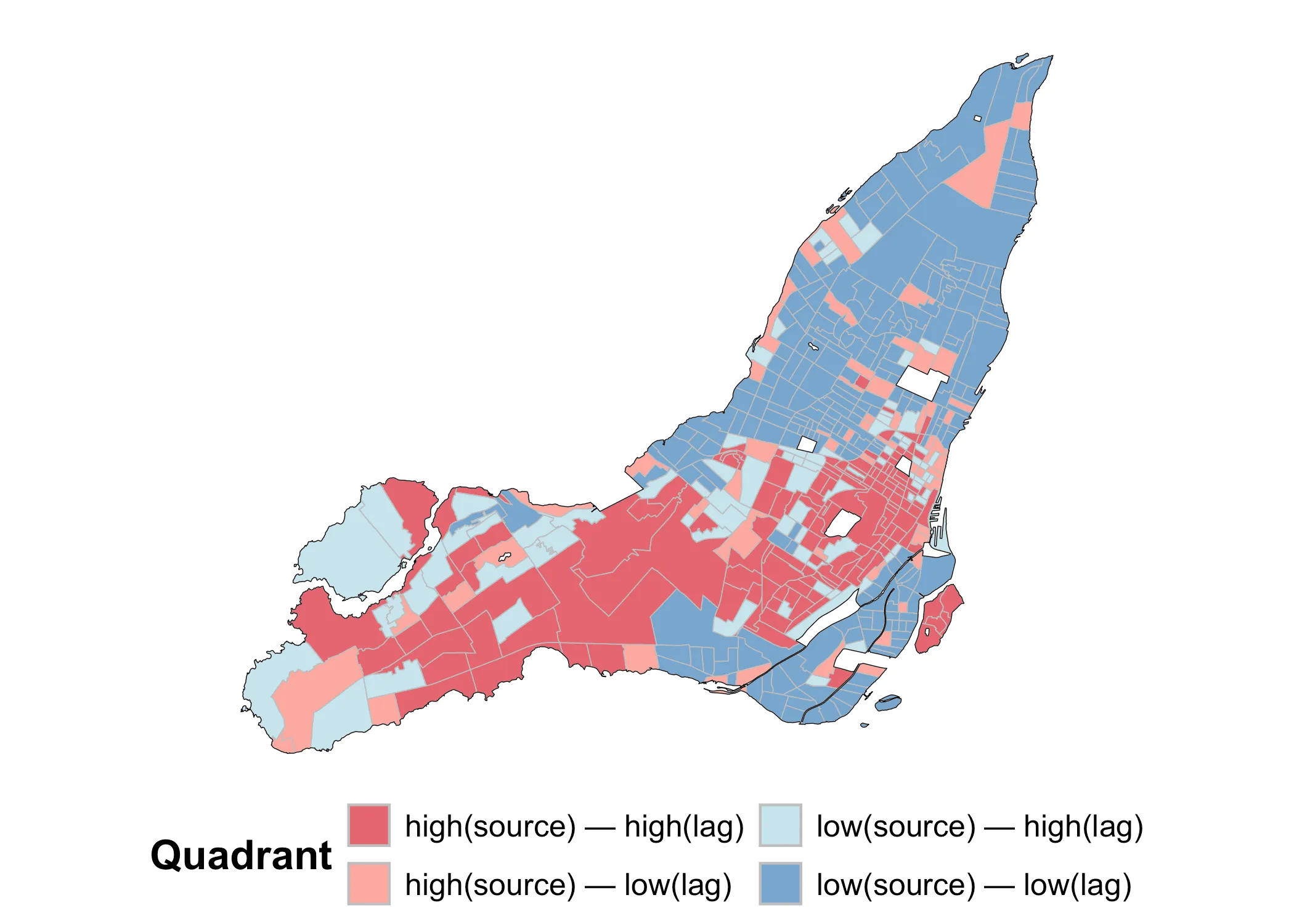
Notice how dark red and dark blue values tend to be grouped together. This is because they are by definition areas where similar values are grouped together. By contrast, the light red and light blue values are areas of dispersal. In this case, Moran’s I is positive because clustered values (whether high or low) are grouped together.
Next I will move to consider Moran’s mathematically. If you want to skip this section, feel free to do so and jump straight to the section on the Local Moran’s .
Understanding Moran’s mathematically
(1st Interpretation)
Read it
Having a visual sense of what Moran’s I does, let’s dive into the Math a bit. There are different ways of writing the equation for Moran’s I. My preference is the following:
Where is Moran’s I, is the weights matrix denoating all the adjacency relations in our study area, is the standardized value of our variable of interest in target area , and are the standardized lagged values of the neighbors of . What we have here, is the spatial covariance (nominator) divided by a normalizing sum (denominator) of all the weights in our weight matrix:
Let’s simplify the denominator. If we have already normalized our weights matrix , then the denominator is just the total number of sources in our study area:
This normalization implies that the sum of the weights for each is one. In spdep, we do this by setting style = Wi in nb2listw(), which is what we did above. When we sum over we just get the total number of areas .
The standardized values of our sources and targets are just each value and subtracted by the overall mean and divided by the standard deviation :
These all add up to the spatial covariance:
What is happening here? In words, we are (1) going over each area , then (2) multiplying its standardized value () with the standardized “lagged” value () of each of its neighbors . We multiply each of these products with the weight matrix . Then, we (3) sum these values for each area () and then (4) sum all these sums ().
After (5) normalizing (division by ), we get the global Moran’s I value:
The Moran’s is simply the normalized sum of all the products between our values and their lagged values.
Understanding Moran’s mathematically
(2nd Interpretation)
Read it
Notice above that Moran’s was also the slope that traces the relationship between values and their lagged values. This is a second useful interpretation of Moran’s . Let’s write the lagged values of simply as:
Let’s try to get from this definition to something where could be interpreted as the slope connecting to . We can start by noting that:
Why is this? Because summing over the square of a standardized value, we get approximately the sample size . This is a basic property of standardized data and gives us:
This, in turn, gives us:
I.e. Moran’s I is the coeficient regressing the values of targets against their . In other words, Moran’s I is the slope connecting the value in an area to the summed values of its neighbors.
2. Local Moran’s
So far, we have considered Moran’s as a global property. In this guise, it answers two simple questions: (1) Is there spatial autocorrelation in our data and (2) how much? What it doesn’t tell us, is where the autocorrelation is occurring and in what kind of patterns (beyond the general observation that it’s positive or negative, clustered or dispersed). In order to explore these questions, we need to turn to the Local Moran’s .
Note the index here. It signals to us what Local Moran’s is all about: The lag of some value in each area in our total area of interest.
To calculate the Local Moran’s values, we can once again use spdep:
lmoran <- localmoran(data_2021$shelter_30_2021,
nbw,
alternative = "two.sided")
Just like before, we use our variable of interest, the weights in nbw, and we test for both negative and positive autocorrelation by setting alternative = "two.sided". In return, we get the following, somewhat confusing output:
summary(lmoran)
Ii E.Ii Var.Ii Z.Ii
Min. :-4.146530 Min. :-0.0462212 Min. :0.00000 Min. :-3.8921
1st Qu.:-0.007483 1st Qu.:-0.0016046 1st Qu.:0.01387 1st Qu.:-0.1399
Median : 0.129577 Median :-0.0006318 Median :0.05619 Median : 0.7431
Mean : 0.346650 Mean :-0.0018939 Mean :0.19018 Mean : 0.7558
3rd Qu.: 0.389070 3rd Qu.:-0.0001421 3rd Qu.:0.17107 3rd Qu.: 1.4668
Max. : 7.903196 Max. : 0.0000000 Max. :7.74413 Max. : 7.4394
Pr(z != E(Ii))
Min. :0.0000
1st Qu.:0.1120
Median :0.3368
Mean :0.3726
3rd Qu.:0.5855
Max. :0.9930
What are these? Let’s take a look at the key outputs that we will actually use:
- Ii: Local Moran’s for observation
- Z.Ii: Standardized Score (z-value) for
- Pr(z > E(Ii)): P-value for each
Then there are some other values, which are interesting but we won’t actually be using them here:
- E.Ii: Expected Value of under the Null Hypothesis
- Var.Ii: Variance of under the Null Hypothesis
Understanding Local Moran’s visually
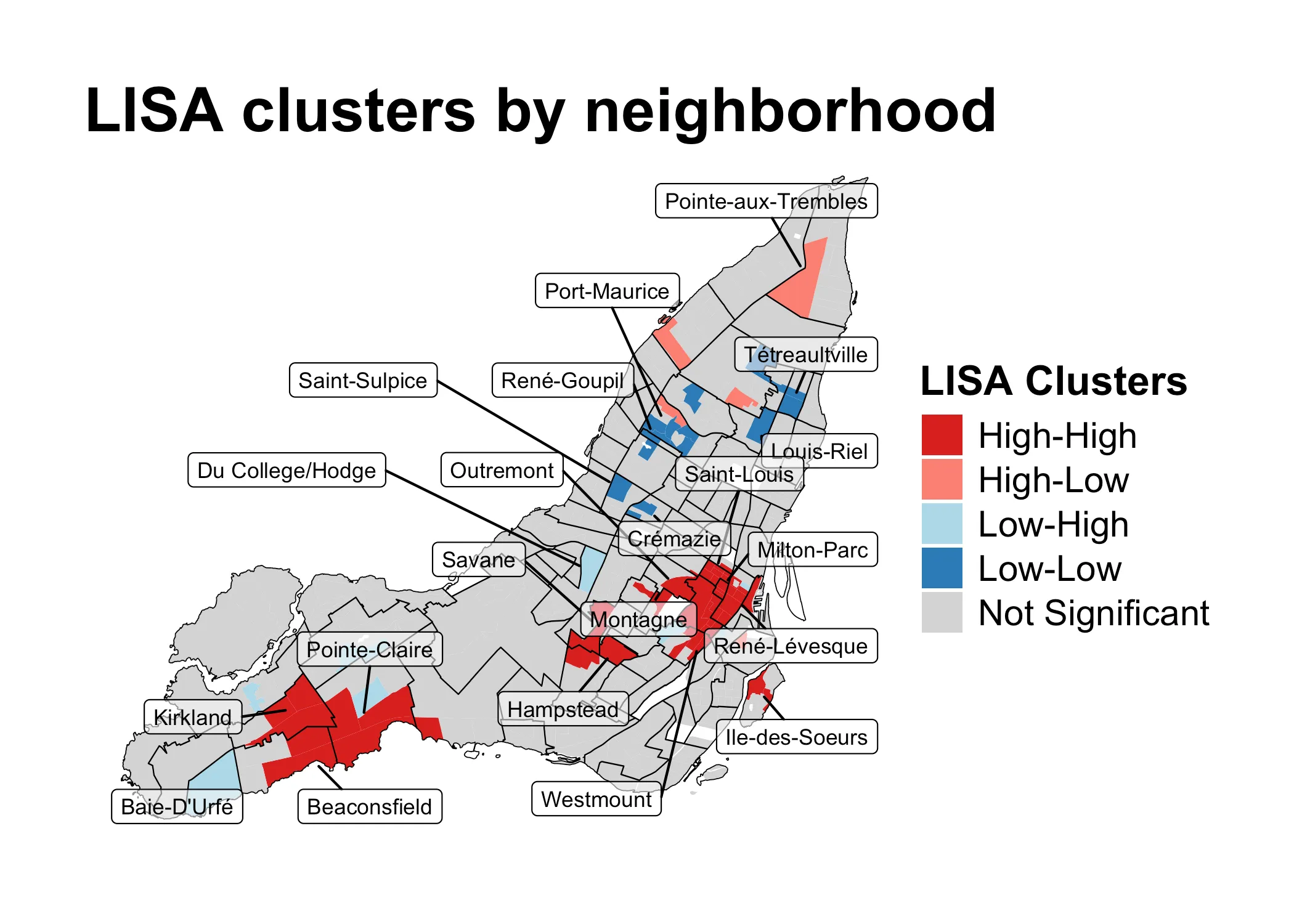
Let’s again start with building visual intuition. The purpose of the Local Moran’s is usually to explore what is known as LISA-clusters, short for “Local Indicators of Spatial Association”. Typically, these clusters are visuallized as follows:
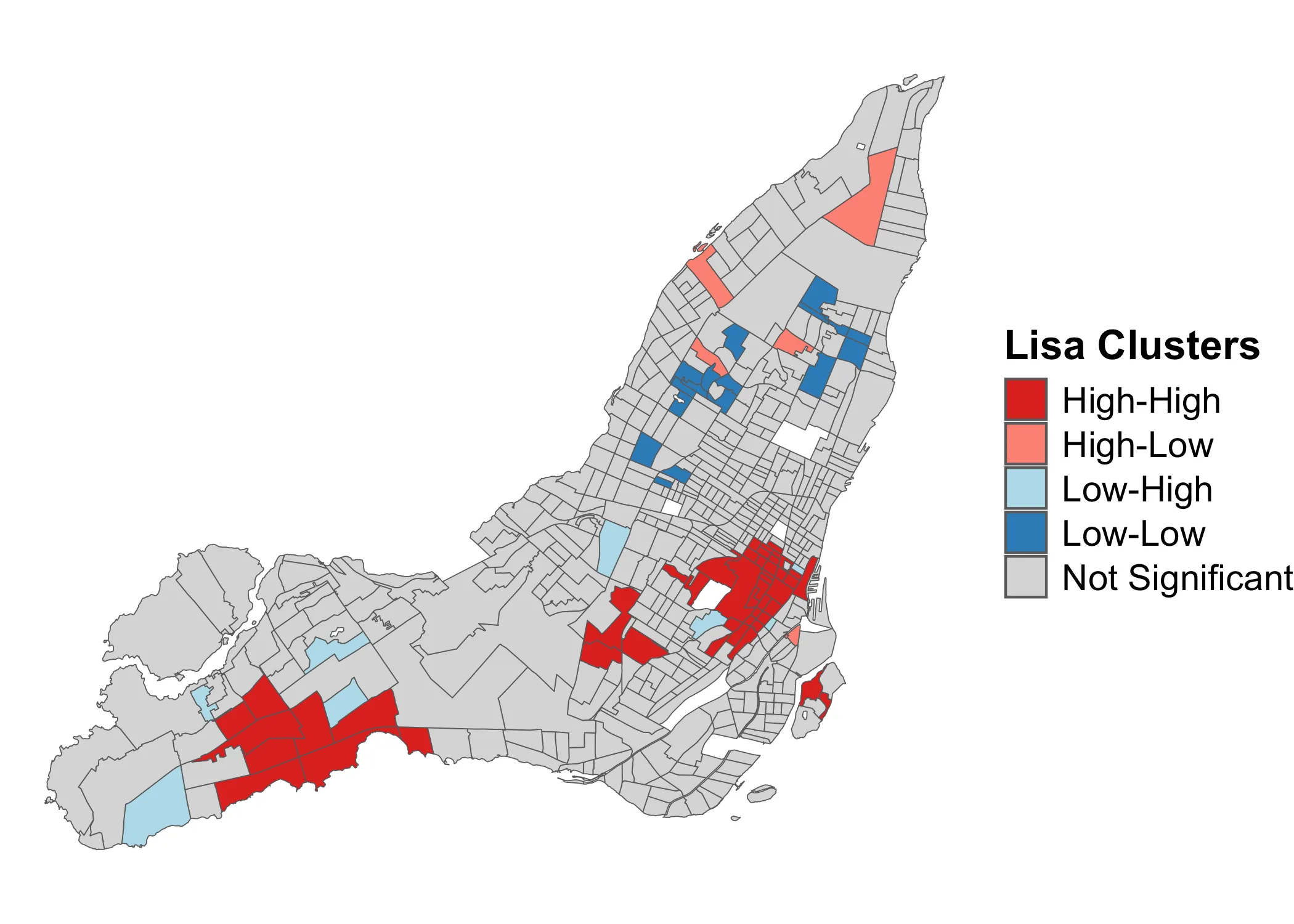
What this map shows, is clusters of high and low values, along with areas where dispersal is occuring due to neighboring dissimilar values. The grey areas are not statistically significant. It’s a very useful map, and very commonly used in empirical spatial research on issues ranging from income inequality and transit justice to changes in land use.
This map shows the results of a three-step algorithm. I will use some Math notation here which I introduced above in the sections of the Math of the Global Moran’s . If you want a more rigorous definition of this notation, go back to that section.
The algorithm progresses as follows:
- For each area , compare its standardized value to the lagged sum
- Based on the comparison, sort into one of four categories:
- High-high, if and
- High-low, if and
- Low-low, if and
- Low-high, if and
- Check p-values for each and exclude areas under statistical significance threshold (e.g. ). If an area doesn’t cross the threshold of statistical significance, it is discarded from the analysis (i.e. marked as grey in the above map).
While this map looks in many ways similar to our map of the individual components of Global Moran’s , it is not the same thing. Let’s go over, step-by-step, how we get to this map. For this, we need to move into the Math a bit.
Understanding Local Moran’s visually & mathematically
We begin by adding the relevant values from the lmoran object to our data:
data_2021$lmI <- lmoran[, "Ii"] |> unname() # local Moran's I
data_2021$lmZ <- lmoran[, "Z.Ii"] |> unname()# z-scores local Moran's I
data_2021$lmp <- lmoran[, "Pr(z != E(Ii))"] |> unname() # p-values
Now, we can look at the first variable of interest, the raw local values in lmI:
Code
data_2021 |>
ggplot(aes(fill = lmI)) +
geom_sf() +
# Change to different color scales here
scale_fill_gradientn(
name = "Local Moran's I",
labels = scales::comma,
colors = viridis::viridis(10)
) +
theme_void() +
theme(
legend.title = element_text(size=16, face="bold"),
legend.text = element_text(size=14)
)
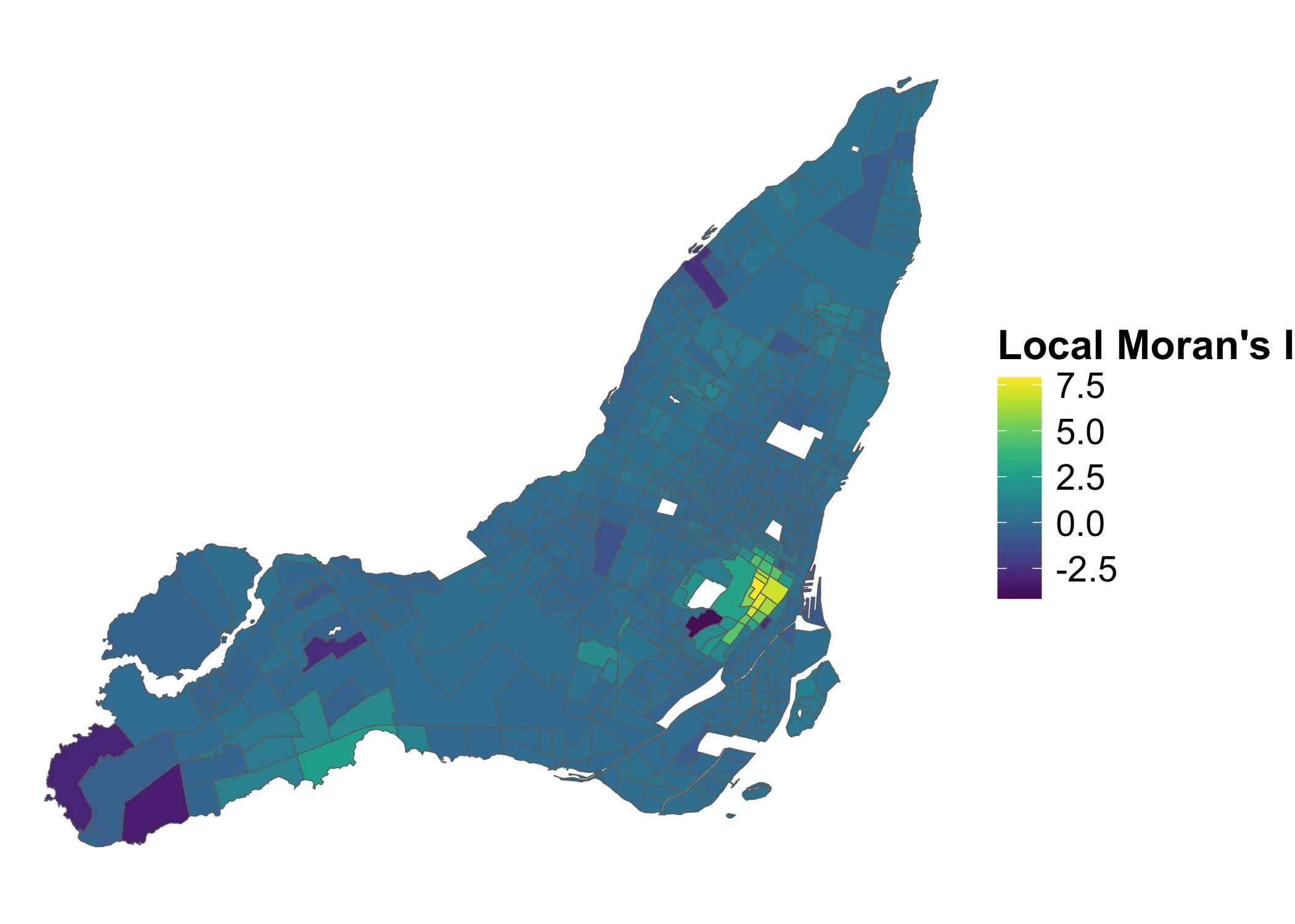
What do these values describe? They are the outputs of the function for Local Moran’s , i.e. the the product of the standardized values in each area with the standardized values of their neighbors in areas . Check the mathematical aside, for details on this.
Local Moran’s I Math
The Local Moran’s can be defined as:
In other words, each Local Moran’s value, is the product of the standardized value of our variable of interest in area and the sum of the standardized lagged values around it, in it’s neighbors . If we standardize this value itself, we get:
Using these Z-values of the Moran’s , we have the distribution from which we can get our p-value thresholds for testing the null hypothesis that the Local Moran’s values come from a random distribution, rather than the one we are seeing here.
This is how the z-scored Local Moran’s values are distributed:
Code
data_2021 |>
ggplot(aes(fill = lmZ)) +
geom_sf() +
scale_fill_gradientn(
name = "Z-score",
labels = scales::comma,
colors = viridis::viridis(10)
) +
theme_void() +
theme(
legend.title = element_text(size=16, face="bold"),
legend.text = element_text(size=14)
)
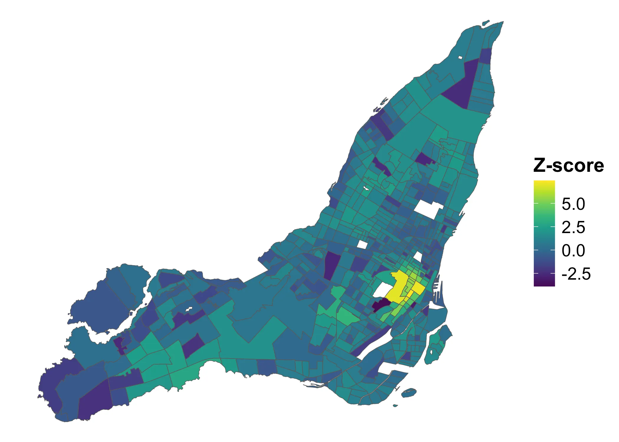
If we consider any Z-score above to indicate clustering and below to indicate dispersal, we get the following map:
Code
data_2021 <- data_2021 |>
mutate(lmZ_cat = case_when(
lmZ <= -1.96 ~ "neg",
lmZ >= 1.96 ~ "pos",
.default = "none"
)) |>
mutate(lmp_cat = ifelse(lmp < 0.05, T, F))
data_2021 |>
ggplot(aes(fill = lmZ_cat)) +
geom_sf() +
scale_fill_manual(
name = "Spatial Autocorrelation",
values = c("neg"="orange", "none"="lightgrey", "pos"="green"),
labels = c("Negative (Z < -1.96)", "None", "Positive (Z > 1.96)")
) +
theme_void() +
theme(
legend.title = element_text(size=16, face="bold"),
legend.text = element_text(size=14)
)
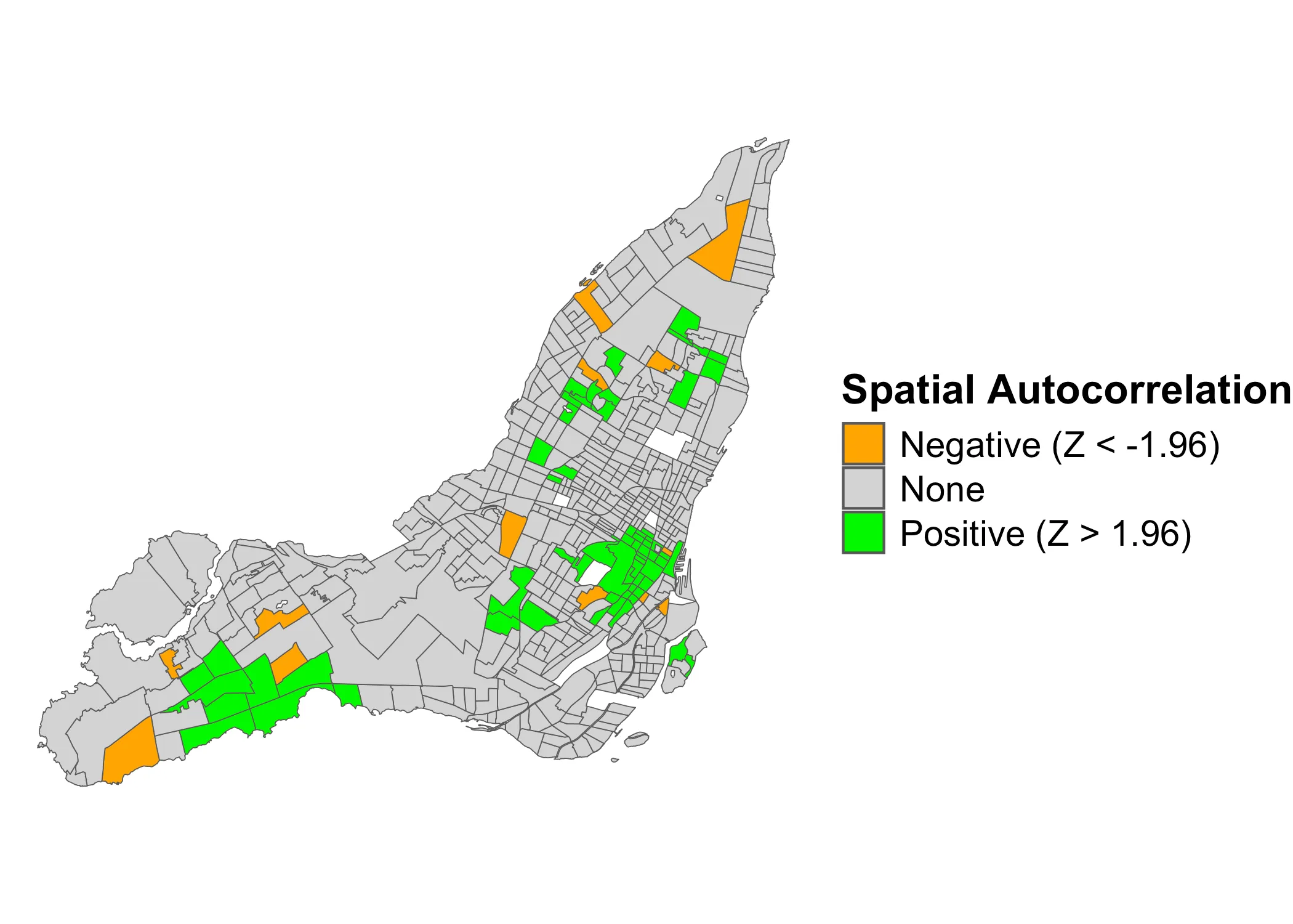
Here, the orange values indicate dispersal and the green values clustering. However, this is not as granular as the LISA-clusters. It only tells us where there is significant clustering or dispersal. It does not tell us if (a) the clustering is between positive (High-high) or negative (Low-Low) values, nor does it (b) tell us if the dispersal is between high-low or low-high values.
However, using these Z-values, we can generalize to the following p-value map:
Code
data_2021 |>
ggplot(aes(fill = lmp_cat)) +
geom_sf() +
scale_fill_manual(
name = "P-values < 0.05",
values = c("TRUE"="pink", "FALSE"="lightgrey"),
labels = c("P < 0.05", "P > 0.05")
) +
theme_void() +
theme(
legend.title = element_text(size=16, face="bold"),
legend.text = element_text(size=14)
)
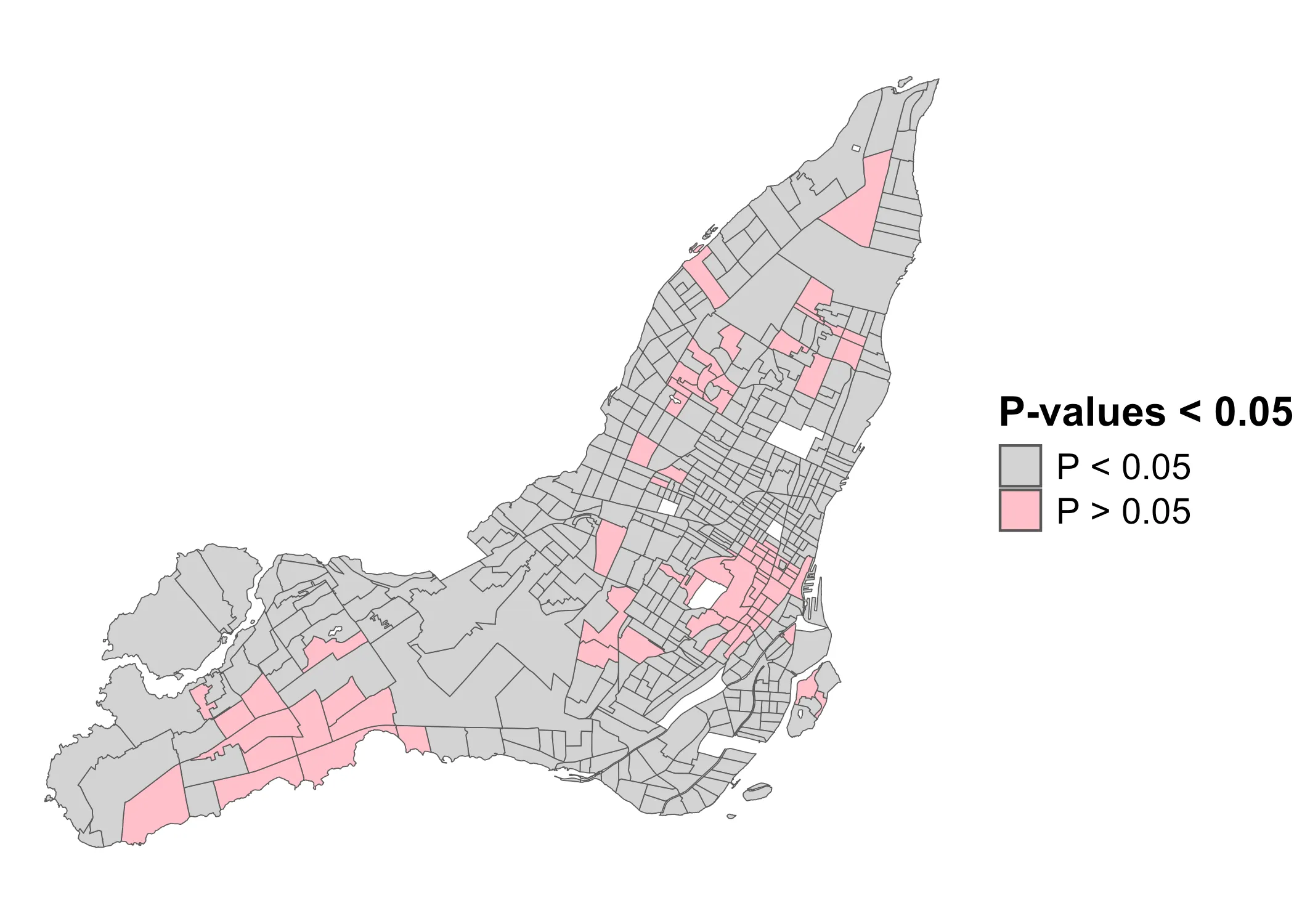
This is where there is significant clustering or dispersal. Now, using these p-values, we can finally get the LISA-clusters. We need three components:
- The p-values (above)
- The standardized values
- The standardized values
We already have component #1. For component #2, we can use the custom function below, which basically replicates the scale function in R:
standardize_variable <- function(data, variable) {
# Standardize the variable values to obtain z-scores
x <- data[[variable]]
data$z <- (x - mean(x)) / sd(x)
return(data)
}
data_2021 <- standardize_variable(data_2021, "shelter_30_2021")
For component #3, we need to get the lagged values of each area . For this, we can use the lag.listw function in spdep. To make things more simple, I’ve wrapped it in a function:
lag_variable <- function(data, neighborhood) {
# Compute the spatial lag of the standardized values using the spatial weights
data$lagz <- spdep::lag.listw(neighborhood, data$z)
return(data)
}
data_2021 <- lag_variable(data_2021, nbw)
Now we have all the components: (1) The standardized values of our variable, (2) the standardized lag-values, (3) and the p-values for each area . We can calculate the LISA clusters with the following function:
get_LISA_clusters <- function(data, lmoran, p_value = 0.05) {
# Set the LISA-clusters
data$LISA_cluster <- NA
data$LISA_cluster[
data$z > 0 & data$lagz > 0 & lmoran[,"Pr(z != E(Ii))"] < p_value] <- "High-High"
data$LISA_cluster[
data$z < 0 & data$lagz < 0 & lmoran[,"Pr(z != E(Ii))"] < p_value] <- "Low-Low"
data$LISA_cluster[
data$z > 0 & data$lagz < 0 & lmoran[,"Pr(z != E(Ii))"] < p_value] <- "High-Low"
data$LISA_cluster[
data$z < 0 & data$lagz > 0 & lmoran[,"Pr(z != E(Ii))"] < p_value] <- "Low-High"
data$LISA_cluster[is.na(data$LISA_cluster)] <- "Not Significant"
# Return the data with the LISA-clusters
return(data)
}
data_2021 <- get_LISA_clusters(data_2021, lmoran)
Notice, how we use lmoran[,"Pr(z != E(Ii))"] and compare it to a p_value = 0.05 to settle which rows in the data belong to which LISA-cluster. And now we can map it:
Code
data_2021 |>
ggplot(aes(fill = LISA_cluster)) +
geom_sf() +
scale_fill_manual(
name = "Lisa Clusters",
values = c("Low-Low"="#2c7bb6",
"Low-High"="lightblue",
"High-High"="#d7191c",
"High-Low"="salmon",
"Not Significant"="lightgrey"),
#labels = c("Negative SAC", "No SAC", "Positive SAC")
) +
theme_void() +
theme(
legend.title = element_text(size=16, face="bold"),
legend.text = element_text(size=14)
)
Bringing it all together
What have we learned about the distribution of relative shelter costs? Using the Global Moran’s , we learned that they are significantly clustered. We also got a first sense of how these values are distributed, using a quadrant map. However, these observations were not yet statistically significant local statistics. Using the Local Moran’s , we learned that positive autocorrelation characterizes downtown Montreal, some of the independent municipalities around Beaconsfield as well as the area around Hampstead and Côte Saint-Luc. These are all wealthy areas, where we would expect rents to be high. The below map shows these patterns. It could, for instance, function as the starting point for further investigation.